Demos▸
1.
This Website
This website is a fully-custom design both on the backend and frontend. This page describes how the website is structured on the backend and demonstrates some of the interesting features developed for the frontend.
Backend Description
The image below gives a good summary of the major building blocks of the backend environment.
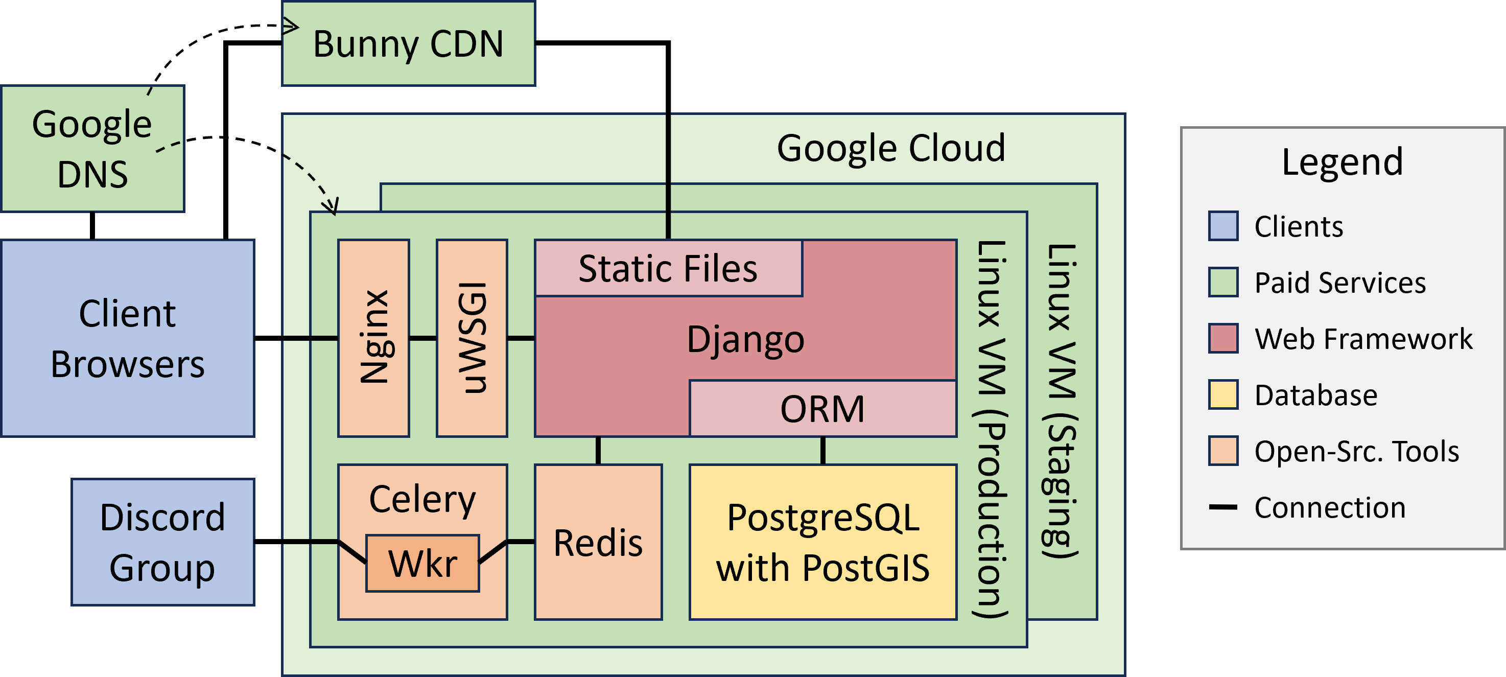
The core of the backend is handled by Django, a high-level Python web framework used by other major websites such as Instagram, Pinterest, and Mozilla. The database is built on PostgreSQL, the most popular free and open-source relational database management system, and is enhanced with PostGIS, which extends support for handling geographic data.
The system runs in a Linux (Debian 10) virtual machine (VM) running on Google Cloud Compute Engine. Deploying the system as a virtual private server (VPS) means we can scale up the capabilities of the system when needed, only pay for what we use, and can easily spin up a smaller scale staging machine to test changes on a cheaper platform before deploying said changes to the production environment.
Several other powerful open-source tools help our server to communicate with our clients. To handle clients' browser traffic, we use Nginx as our webserver and use uWSGI to launch and contain the Django application, which performs automatic load balancing and enables communication with webservers like Nginx. Alternatively, to serve clients in the Discord group and perform other asynchronous tasks, we use Redis as a message-broker to communicate with Celery, which can launch workers to communicate with our Discord bot and handle other tasks.
In addition to the Google Cloud, we use several other paid services to keep things running smoothly. Django does a great job of consolidating all the website's static files (CSS, JS, images, etc.) in a convenient accessible location, and from there we use the Bunny Content Delivery Network (CDN) to ensure copies of these static files are cached all over the world, significantly reducing latency to our users. We use Google Domains to set up DNS records for our domains and subdomains, redirect unsecured requests, reroute emails, and point to our CDN via an alias.
Frontend Features
This website's frontend also benefits from several interesting designs/features. Below, we describe the most important ones and demonstrate with simple videos or examples when possible.
Responsive Design
Responsive design is an approach that ensures content renders well regardless of the user's viewing device (e.g., phone, tablet, computer). Basically, things should look good for whatever size/shape rectangle the website fits in, and controls should work for both mouse and touch (no VR yet).
We want all our users to enjoy our products on all their devices, so we take responsive design very seriously. Feel free to experiment either on this page or anywhere else on this site both on your phone, by switching between vertical and horizontal orientations, or on your PC by popping the window out of fullscreen and sliding around to various shapes and sizes. You'll initially see big changes in some cases with images changing sizes and sometimes position and the navigator and table of contents panels shifting around. If you look closer though, you'll also see different behaviors based on which dimension is shrinking, such as the windows vertical/horizontal padding, or how the header tries compressing to free up more window space.
Image Repositioning
When including images within text, it's nice to not have huge sections of empty white space, but enlarging an image too much might also look bad, so it's nice to allow text to wrap around smaller images when screens grow larger. With our tools, a designer only needs to include the class structext-float-left or structext-float-right to press an image to the left or right, respectively and allow text to wrap around when there is adequate space. Adequate space is defined as not squeezing the text under a certain limit, which can be specified per floating element if desired via the CSS variable --structext-float-text-width-min.

The image on the right (or just above on narrower screens) shows an example of how we construct a right-floating image. In fact, it's an image showing it's own HTML code. Yes we know, very meta! Anyways, play around with changing the screen with (or rotate your phone to change orientation) to see the image reposition itself from floating on the right to popping up above this paragraph. The image generally tries to satisfy the specified CSS width parameter, but if the screen gets narrow enough, the image will shrink its width accordingly.
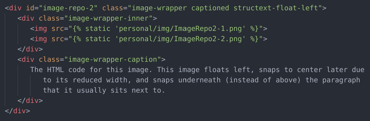

The second image demonstrates a slightly different setup. In addition to floating on the left, the reduced width means that image can float on narrower screens than the first image can. Even more interesting is the 2nd bit of code shown below the image declaration.
Normally, when images snap to center, they go above the paragraph that they usually sit next to. However, sometimes depending on how you are discussing a topic and maybe the image itself, it can be a little awkward to present the image before the associated paragraph. When the screen is wide enough, there's no issue because the reader can see both at the same time, but on smaller screens you'd want the image to be placed somewhere lower. By adding a div with the class structext-squeeze-target, you can indicate to the repositioning JS process that you actually want the image to jump to the new div's location when it snaps to center.
Auto-Scaling Text
In certain situations, you would like some text to fill up an area, regardless of what text is actually in that area or even as the area itself may change shape/size, which is important for responsive design. There are some basic methods that partially work, such as setting the font size as a percentage of the viewport height or width in CSS, but these methods don't work in general (e.g., only works if the area stays proportional to the viewport and doesn't cover changing text). We felt that solving this issue was important enough that we developed a custom JS solution for it. Now we can simply add the class auto-scale-text to any HTML element and all its text will be automatically scaled appropriately.
An example of auto-scaling text on this page can be found in the navigator buttons, which always fit titles inside the same button regardless of the title's size. You can also play around with the example below to see the effects in action.
Move the mouse around this area (or touch with your finger) to resize the box and watch as the text inside is automatically scaled to fit perfectly within!
Albums
We had several situations (e.g., user testimonials or many images related to the same text thread) where we wanted to present users with several pictures and videos, but we didn't want to take up a ton of space either. Instead, with an album, we can easily condense several items into one area, allowing the user to peruse these items as if they were turning pages in a book.


Our albums are highly customizable and perform some impressively behind the scenes to ensure that everything works just as a user would expect from a built-in browser utility. Using another custom-built library to track touches, grabs, and slide motions, turning album pages is as simple as grabbing the content (with mouse or touch) and sliding left or right. Sliding really fast will let you skip many pages at once, and once the sliding stops, a particular page is settled on. If you don't want the hassle of sliding, clicking the buttons on the side will flip album pages for you as well.
Sometimes the content you want in an album aren't all the same size, but you don't necessarily want to enlarge the entire album and add a bunch of white space that isn't needed for the smaller items. A basic solution is to shrink the larger items and make it scrollable. Unfortunately though, on mobile, where everything including scrolling is controlled by touch, it can get very complicated to determine if something is a page turn, a scroll on the tall page, or a scroll on the entire website page itself. Instead of explaining it all in text, the 1st example on the right (or above) shows how all this potential confusion plays out, and we think you'll find the controls are pretty intuitive on both PCs and mobile.
Note that if your initial sliding motion is very vertical, the album may assume you only intend to scroll vertically and will help you by locking sideways sliding until you regrab.
The 2nd example below is a bit more interesting. Setting the CSS variable --album-is-wrapping to true makes the album wrap around to the beginning after the final page. The album is also stretched wide so several pages can be seen simultaneously. And finally, we wrote a Wistia extension to our album class that allows it to handle embedded Wistia videos and automatically pause them if the user slides them out of view.


Collages
We created the collage utility so we could combine text, images, and videos in an interesting way to catch users' eyes, mostly for promotional purposes. A designer can include any HTML elements in a collage and completely define how each is animated using through CSS, including when they appear, the duration of their appearance, how quickly they fade in/out, and how to transform them along the way.


This is a collage
Make any HTML object appear, float around, and disappear
Set any schedule and any starting/finishing transform path using normal CSS
Items can continuously cycle, exist for only certain cycles, or last forever without disappearing
This is the 1st cycle
That was the 2nd cycle
Why are you still watching these?
I guess it is kinda mezmerizing
Okay, but seriously...
Aren't you bored yet?
How does this end?
You need to go now
It may appear simple to use, but we put significant work into making intuitive controls that abstract away the underlying complexity including a CSS transform-manipulation library. For example, we wanted a designer to be able to specify an offset transform through the normal CSS transform property that would be applied to an elements main 3 keyframe transforms (initial, neutral, and final). Ideally, we want to see the original transform definition that specifies translation, scaling, rotation, and skew separately instead of as a 2D linear-transform matrix, which is a many to one mapping that reduces our control. Unfortunately, in JS, the CSS transform property can only be read in matrix form, so we created a mathematical process of backward extrapolating the original separated transform properties before we can process the other transforms normally.
Collages can be made cyclical, meaning they reset after a certain time and repeat their animations, and the designer can control in which cycles each element appears. For example, in the collage above, the final text in the bottom left keeps changing every cycle, because there are actually several text elements there that each appear for 1 cycle, except for the final one that repeats indefinitely.
We also put effort into making these collages presentable and gracefully handle challenges that come from being at the top of a page or down lower. When a collage is at the top of a page, users will be annoyed if they have to wait a few extra seconds because the collage's videos and images are still loading. To ease the wait, a collage can display an initial freeze frame of things (generated automatically) until it has enough content loaded to start playing normally. Additionally, the collage can determine when it's safe to start playing even when some content that shows up later hasn't fully loaded yet. And for content further down the page, a designer can set the collage to wait until a user scrolls within a certain distance of the collage, ensuring users get to see the beginning animations.
Auto-Structured Text and the Table of Contents
When you have a lot of information to present to the user, it's helpful to structure it into sections, both to help users compartmentalize and digest the content and to quickly find specific info they might be interested in.
We had several such situations (including the info on this page) which required structuring the information into sections and subsections, creating various section titles and section numbers, and making these sections accessible via a table of contents (TOC). In order to save ourselves headaches in the long run, we automated as much of the process as possible. Now, using our custom JS, by simply adding the class structext-section to a containing div, all relevant sections and subsections within the div are automatically identified by those sections' headers, and a TOC is automatically populated. Section numbers are automatically added to the header names as well, which frees us from the burden of needing to fix these numbers every time we want to add, move, or delete a section, and ensures no typos sneak in. Clicking any title within the TOC will automatically scroll the page to that section, and to help declutter the TOC, subsections within the TOC can be expanded or collapsed by clicking the corresponding arrow on the right.
The TOC self-resizing behavior is pretty cool too. On wide screens, there's enough empty space on the right for the TOC to be shown in all its glory, but as this white space shrinks on smaller screens, the TOC narrows as well. Eventually, when the screen is too small to justify the extra real estate, the TOC defaults to hiding, but can still be brought out manually as a popup by clicking on the small tab in the upper right corner.
Finally, our script automatically adds a copy button to the right of each section header. The buttons are normally hidden, but can be revealed by mousing over the title (or touching the title on touch screens). Clicking the button copies a special URL onto the clipboard, and navigating to this URL will bring you to the same page, but then automatically scroll the corresponding section. This mechanism makes it really easy for users to record links to specific sections and share with other users in relevant discussions about specific content within the page.
We've included some dummy subsections below for you to play around with.
Level 4 Example
This is just some random text to fill space.
Level 5 Example
Some more random filler text.
Level 6 Example
HTML doesn't support header levels beyond h6, so neither do we. You've officially reached bottom :(
Another Level 5 Example
Getting a bit redundant now.
Page Hierarchy and the Navigator
Sometimes, as with the current overall demo content, there is simply too much information to put on a single page. We still want this content to be structured though, but now we need to add structure/hierarchy between the various related pages instead. This means creating sensible URLs to reflect this hierarchy and providing useful tools to help the user navigate it. Once again, we created a custom tool/process to automate this process and reduce headache/errors.
On the backend, the page-hierarchy tool allows us to specify the hierarchical relationships between pages once, after which the tool automatically creates the appropriate URLs, HTML template names, reverse-URL look-up names, and page titles. On the frontend, there are 3 helpful features that get automatically added to pages (all of which you can observe and experiment with on this page). Firstly, there's a navigator panel on the left side which provides links to all other pages within the hierarchy. As with the TOC, subsections can be expanded or collapsed, and the panel itself conveniently resizes to maximize helpfulness without being in the way on smaller screens. Secondly, there are quick-nav buttons at the bottom of each page to help a user navigate to related pages with they've reached the end of the current one. The navigator panel provides these same helpful buttons, and they even appear at the top of a page on smaller screens so they're immediately available even when the TOC is hidden. Thirdly, the parent pages are indicated above the pages main title up top, reminding users where they currently are within the hierarchy and providing useful links to climb back up.
This area showing various demos doesn't itself demonstrate a very complex page hierarchy, so CLICK HERE to go to a fun example that does.
Header
The website header exists on every page and points to important content, so the it needs to look good and be functional. Our header incorporates 2 features to accomplish this in a responsive way for any screen shape. First, when a screen is compressed vertically (e.g., on mobile in horizontal mode), the header activates an auto-hide mode, where it remains hidden to free up screen space until the user clicks on the header's tab at the top center of the screen. Secondly, on horizontally compressed screens (e.g., on mobile in vertical mode), if there isn't enough room for the header's menu items, these menu items are moved to a hidden side panel overlay that can be revealed by pressing the new header button on the top right.
Popup Messages
Sometimes we have little messages we want to share with the user (e.g., and acknowledgement of some action they just performed or maybe there was an error with something they tried), but we don't want to use the clunky JS alert method. That's why we created our own little popup message utility. You may have already seen these messages if you were playing with the section headers' copy buttons, but you can also see some more messages come up by pressing the buttons below.